
By Syan Schaap
Signs are always fun! Wherever I go, I have the habit to have a good look at the signage, and I try to decide how clearly understandable a sign is. Signage is an art, it can well be based on scientific insights, but it also seems to have a cultural aspect to it. In this blog, we will discuss some recent examples that we stumbled into on a visit to Canada and present some basic advice on putting up effective signage.
Anglo-Saxon countries tend to put up loads of signs, even to warn you to look left and right when crossing traffic (seen in Sydney). In the week of 18-24 October 2025, I went to Canada, and it had some interesting signs! When putting up signage, always consider how much time a person has to read the information. Traffic signs often tend to have too much information for passers-by and motorists to process. (Photo 1)
Secondly, how unambiguous is the message? It may well be that it’s locally well-known but totally unclear for anyone not from there. For example, for me the orange sign with the man walking towards the door that already says “Danger” was quite troubling. Is this man wearing an explosive (because in Europe, orange means explosive or fire hazard)? Why are you warning me for him? (Photo 2)
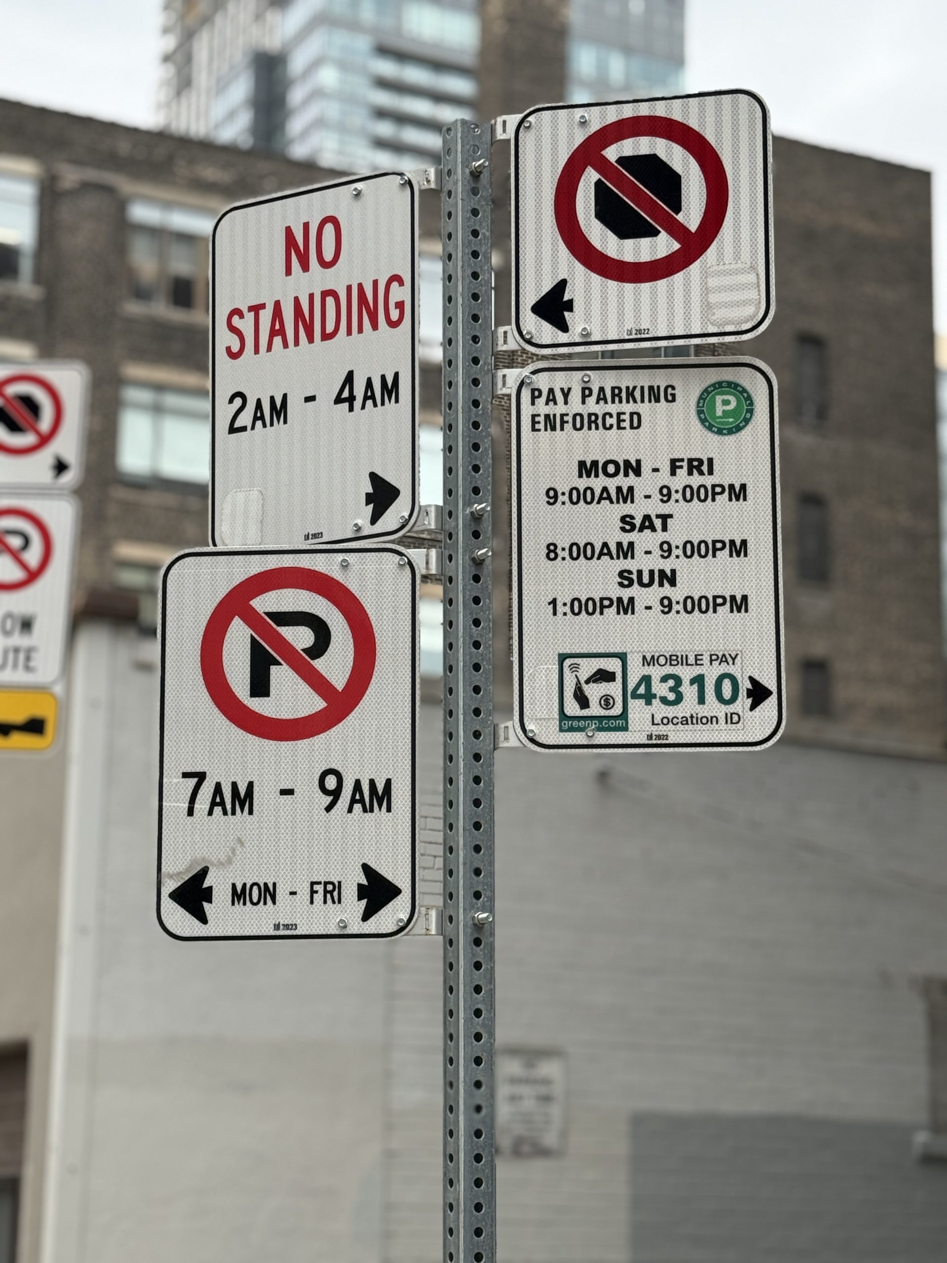
Photo 1
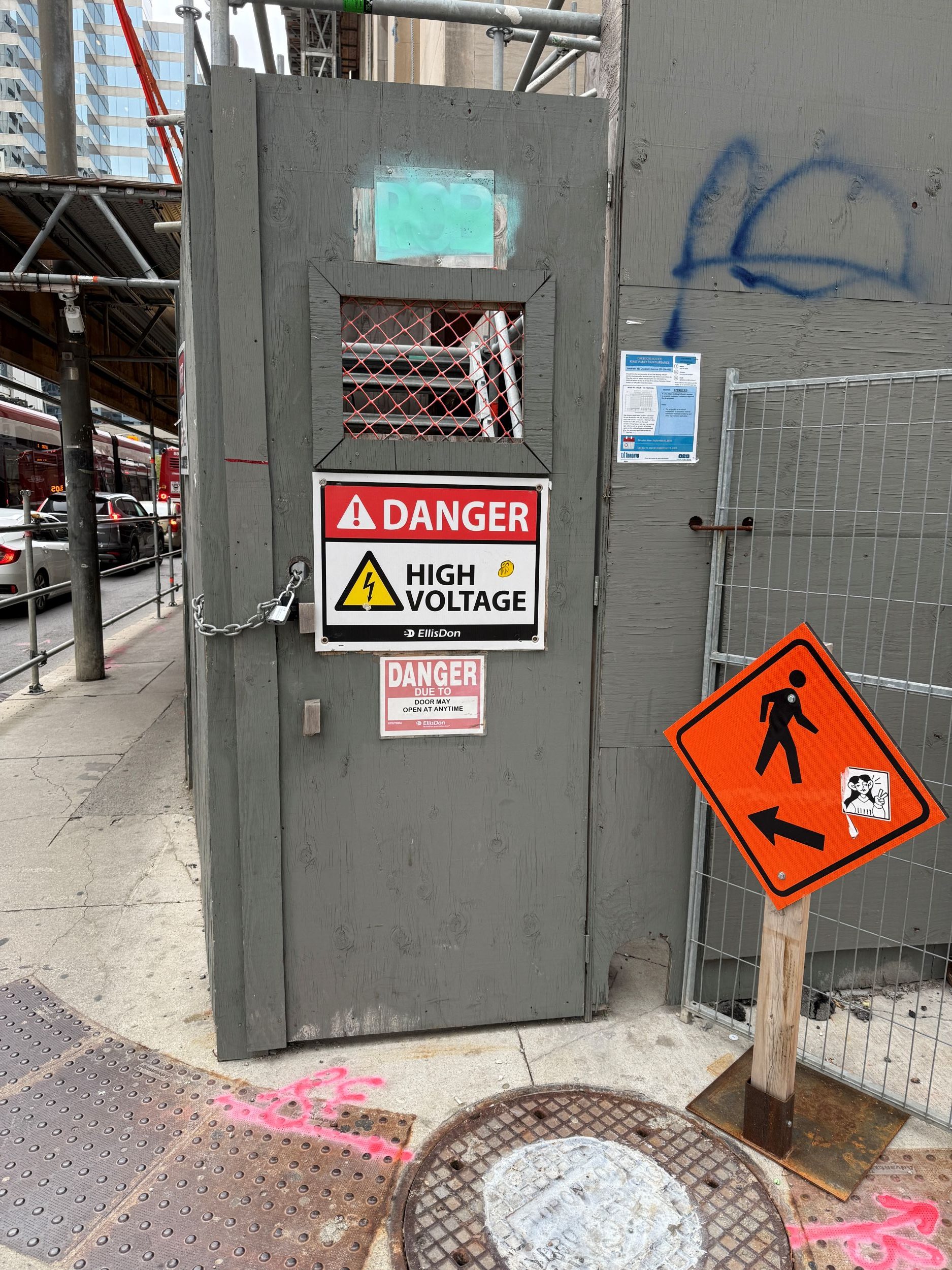
Photo 2
Signs sometimes seem to attract other signs. One sign is not clear enough? Let’s put another one up, just to make sure everyone gets the message. I believe the signs at the fence around the construction site of the new Toronto metro could have been summarized on three simple signs: area under security; construction site safety regulations in place; no parking. Why tell people to wear hearing protection twice? (Photo 3)
Another example. When walking on an open quay in Toronto, it surprised me to meet two different signs telling me to “Keep off” and being in Danger, but at my own risk. What do you want people to do? If it’s too dangerous, shut the quay with a fence! Or just warn for uneven surface. This quay was in fact quite heavily used by couples and runners (slips, trips and falls!). (Photo 4)
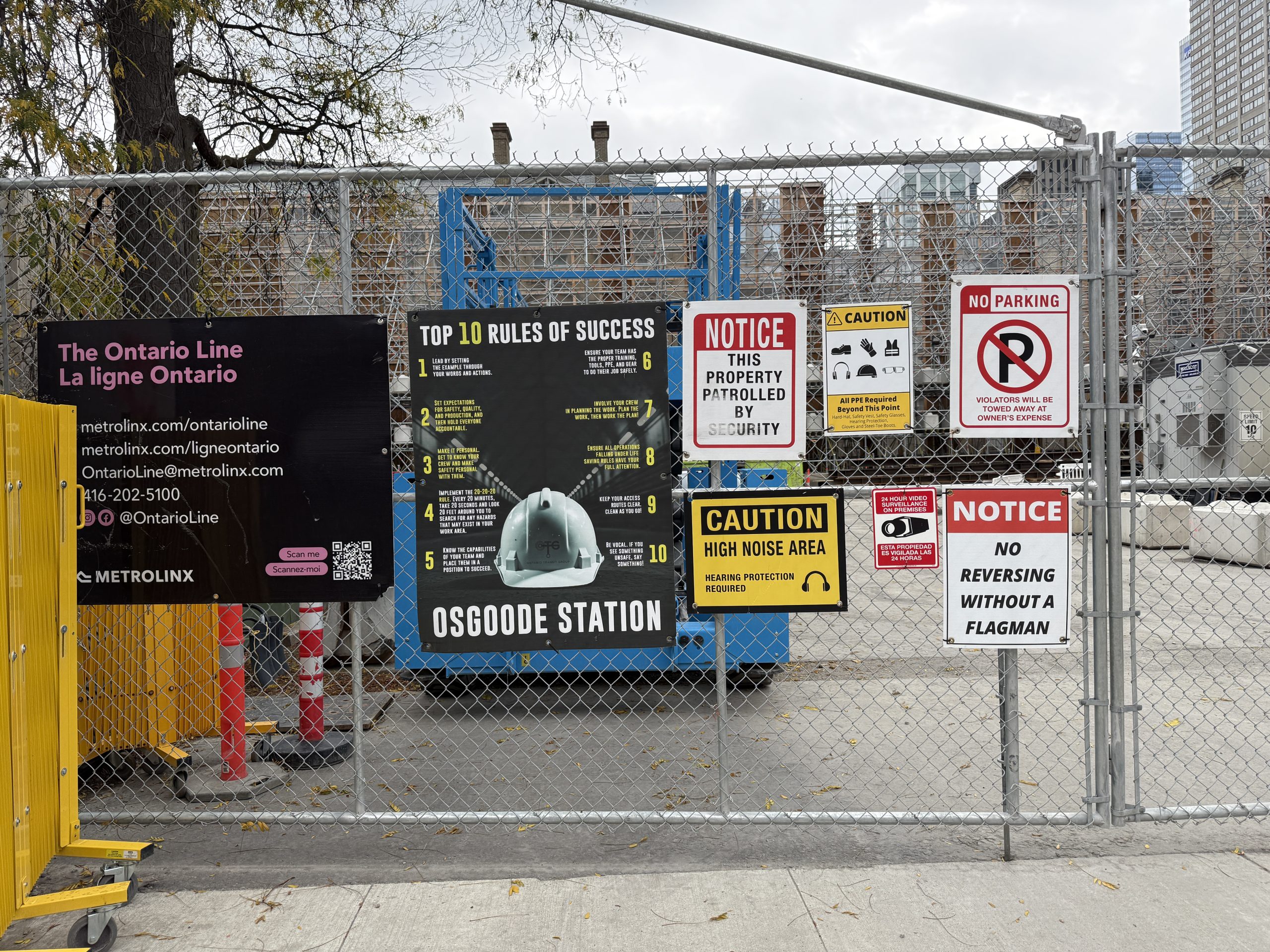
Photo 3
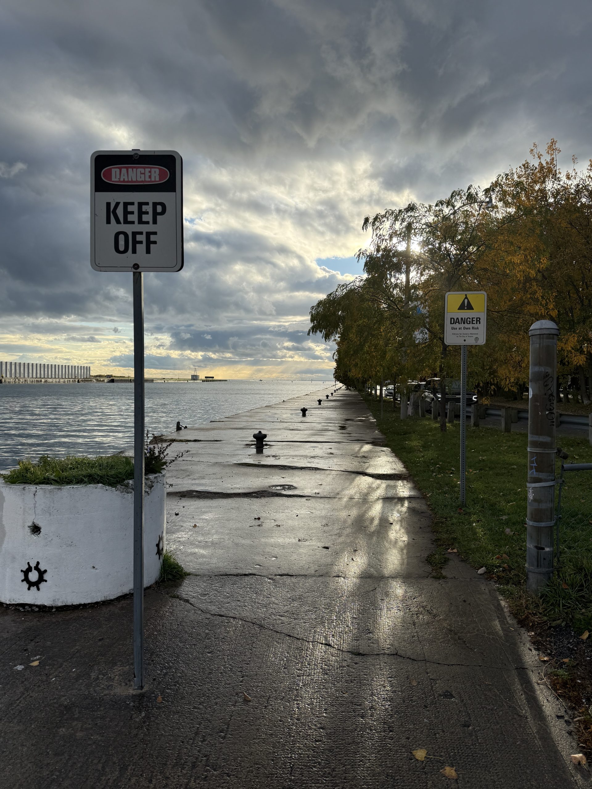
Photo 4
I did like the clear signage at Toronto International Airport. With large, colored blocks, distinctive colors (I like the purple!). Had no problem finding my way, a good example of limited but clear guidance that just gives the information required at that moment. (Photo 5)
One more that got me giggling: I know Canada is a bilingual country, but would a French-speaking Canadian have problems with a sign that says Exit? Does it really need to be in English AND French? Perhaps consider the European option and choose for a symbol instead of letters to point out the emergency exit. You may do more people a favor than you would first expect. (Photo 6)
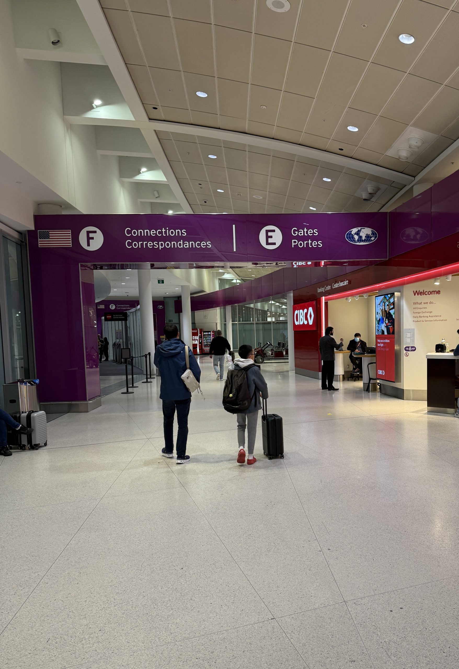
Photo 5
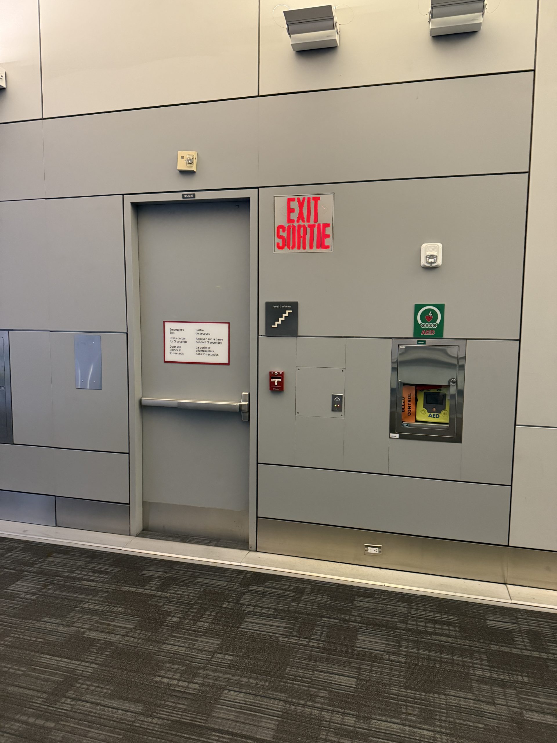
Photo 6
Signage is an art, stick to some basic rules and consider your target group before putting up something that legally may be correct, but has no effect on behavior.
Some basic rules for signage that could help you:
1. Visibility: consider the dimensions, position, light/dark circumstances, and sightlines from anywhere in the targeted area. Is it still visible when the crowd arrives?
2. Simplicity: stick to short, unambiguous messages. Is it in a dynamic environment? Make sure the message can be processed within a few seconds.
3. Access to all: Are you sure your audience are all English speaking? And did you know many people have a reading disorder or a visual limitation? Prefer symbols over words, as long as these symbols are unambiguous to your users.
4. Priming positively: use the techniques that marketeers have been using for ages. Choose colors, fonts, and images that connect to your purpose. Like: red is danger, green is safe. Take some time to design the signs that work for you.
5. Nudging can be part of your signage plan. This can be done by using lines on the floor, painting a bike symbol on a designated bike parking space, or hatching areas where you want people to keep moving.
6. Convincing messaging: choose your words carefully. A traffic sign is not always appropriate and may well be ignored when seen as irrelevant for pedestrians. Maybe you need to convince people that it’s in their own interest to do as you suggest!
7. Consistency: especially when used for wayfinding, signs need to guide you on a gut feeling or through their unconscious brains. Colors, position, repetition, all add to a consistent communication strategy that prevents people from slowing down, wandering around, or taking too much time asking staff for directions.
8. Location: if you need to present a lot of information to people (like at an amusement park, a festival, or an airport), present the information at a point where people have time and space to process the information. Or if you can, try to present more complex information through an app so fewer people need to take up all the information on-site.
9. Time: when to present which part of the info? When do people need the information to make a timely decision (like: taking the next exit on the motorway, or not going to the event because of the weather)? A sign that says go away when people are already there, will probably create some resistance.
10. Static or dynamic information? Static signs are cheaper and can last for decades if they stay relevant. But while the event takes place, you might want to present different messages during the day. Consider placing mobile LED signs; their effect may be a lot higher than your original signs.
Interested to learn more about effective signage, communicating with crowds, and creating effective crowd management strategies? Consider taking our Applied Crowd Science course or contact us for help.